Interface Guide
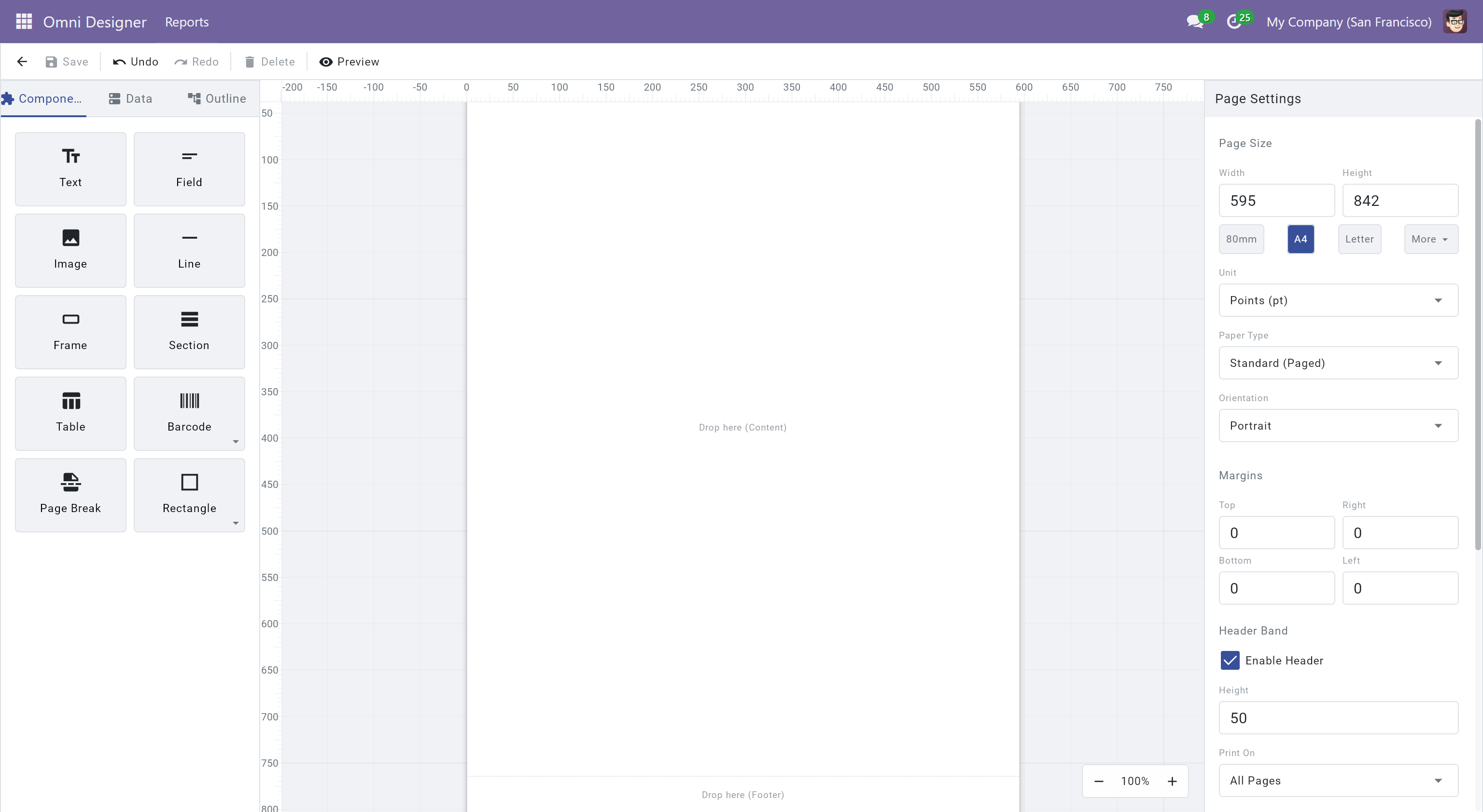
The Omni Designer interface is cleanly divided into four main areas, designed to maximize your canvas space while keeping essential tools within reach: the Toolbar at the top, the Sidebar on the left, the Canvas in the center, and the Property Panel on the right.
Toolbar
Section titled “Toolbar”Located at the very top of the window, the toolbar provides essential global actions, file management, and quick-access alignment tools.
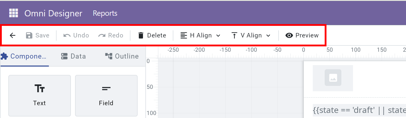
- Back (Arrow): Return to the Odoo backend interface. Be sure to save your work before leaving!
- Save (Disk): Save the current template. An “Unsaved” indicator will appear as a dot on the right side of the toolbar whenever there are pending modifications.
- Undo/Redo: Revert or reapply actions in your history safely. Omni Designer tracks changes to layout, styling, and data binding.
- Delete (Trash): Remove the currently selected elements from the canvas.
- Alignment & Distribution: (Visible only when multiple elements are selected). Use these handy dropdowns to align selected items horizontally/vertically or distribute the space evenly between three or more elements.
- Preview (Eye): Render the PDF instantly using real Odoo sample data to verify exactly how your report will print.
Sidebar
Section titled “Sidebar”The left panel gives you access to the building blocks of your report, your data models, and the structural outline. You can switch between these features using the tabs at the top of the sidebar.
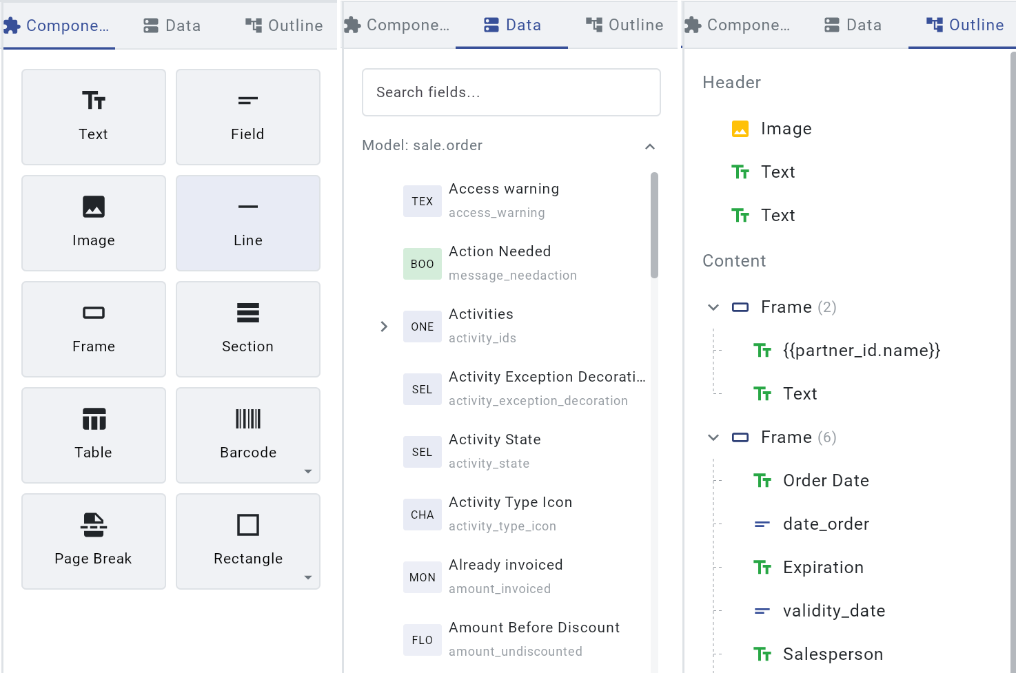
Components Tab
Section titled “Components Tab”Contains all the structural and visual elements you can place on your report. Elements are organized into clear, drag-and-drop tiles.
- Use Text, Image and Field for branding or dynamic content; all three can be bound to data fields for automatic updates.
- Select Shapes and Lines from the dropdowns to create custom dividers or graphical elements.
- Use Table or Frame to structure complex layouts.
- You can find more specific details on what each component does in the Components Reference.
Data Tab
Section titled “Data Tab”Displays the data schema of the Odoo model your report is bound to.
- Search for specific fields using the search bar.
- Expand relational fields (like
partner_idororder_line) using the arrow toggles to explore deeper database structures without writing complex nested loops. - Drag any data field directly onto the canvas. Omni Designer will automatically generate the corresponding Field or Section element.
Outline Tab
Section titled “Outline Tab”Provides a hierarchical tree view of all the elements currently on your report (e.g., Page Header, Content, Page Footer).
- Easily select elements that might be hidden behind others or nested deeply within Tables and Frames.
- Click on an item in the outline to instantly select its corresponding element on the Canvas.
Canvas
Section titled “Canvas”The Canvas is the central area where you visually build your report. It represents the physical page (such as A4 or Letter size) that will be printed.
Selection & Navigation
Section titled “Selection & Navigation”- Click to Select: Click any element to show its selection box.
- Multi-Selection: Hold
Shiftwhile clicking to select multiple elements, or use the Marquee Tool by clicking and dragging a selection box across an empty area to select everything inside. - Zoom & Pan: Use the zoom controls in the bottom right corner, or hold
Ctrland scroll your mouse wheel to zoom in and out. HoldSpaceand drag to pan around the canvas interactively.
Snapping & Guides
Section titled “Snapping & Guides”As you drag or resize elements, they will automatically subtly snap to:
- Page margins.
- The edges and centers of other elements nearby.
- Ruler guides.
You can click and drag from the horizontal or vertical rulers to pull down Custom Guides, which are incredibly useful for perfectly aligning elements across long distances.
Element Operations
Section titled “Element Operations”Omni Designer provides comprehensive tools to manage elements directly on the canvas without relying solely on the property panel.
Context Menu
Section titled “Context Menu”Right-click any element (or empty canvas area) to open a quick action menu.
From the context menu, you can execute common actions:
- Cut/Copy/Paste: Standard clipboard operations.
- Delete: Remove the selected element.
- Layer Arrangement: Elements are stacked in layers. If elements overlap, you can use the context menu options (Bring to Front, Send to Back, Bring Forward, Send Backward) to determine which element displays on top.
Aligning Elements
Section titled “Aligning Elements”Instead of manually typing X and Y coordinates to make things align, you can visually align them:
- Select two or more elements.
- The Toolbar at the top will automatically reveal alignment tools.
- Click to align elements to the Left, Center, Right, Top, or Bottom relative to the selection’s bounding box.
Distributing Elements
Section titled “Distributing Elements”If you are designing a form or header with three or more labels and want equal spacing between them:
- Select three or more elements.
- Click the Distribute dropdown in the Toolbar.
- Choose to distribute them evenly Horizontally or Vertically.
Property Panel
Section titled “Property Panel”When you select one or more elements on the canvas, the right-side Property Panel populates with context-specific settings for the active selection. If you select the empty canvas itself, you will see Page Settings (like margins and paper size).
Depending on the element type selected, you can configure numerous attributes:
- Position & Size: Explicitly define X, Y coordinates, Width, and Height for precision tweaks.
- Styling: Configure Font family, size, weight, color, background colors, internal padding, and precise borders for each side individually.
- Content: Set the static text, upload images, or edit the dynamic expression string (e.g.,
${product_id.name}). - Visibility: Apply logical conditions (like
${amount > 1000}) that evaluate to true or false. Elements will only render if the visibility logic is met, allowing you to build dynamic, responsive documents.